The Museum of Modern Art was born almost a century ago, though it wasn’t until the 1930s that the place had a building to call its own. Edward Durrell Stone and Phillip L. Goodwin’s handsome edifice was a rebuke to West 53rd Street’s staid old townhouses, a work of modern art unto itself. Phillip Johnson added to the building in the 1960s; Caesar Pelli in the 1980s. Yoshio Taniguchi’s 2004 expansion honored all that came before, an architecture of truce.
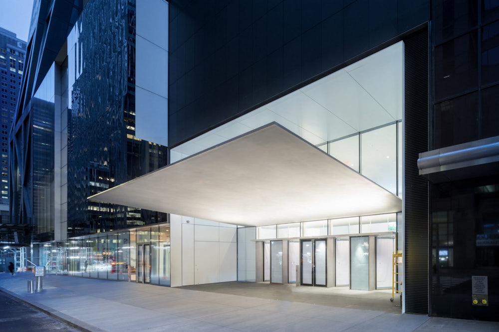
A new renovation—by Diller Scofidio + Renfro, in collaboration with Gensler—is more an architecture of palimpsest, an attempt to bring the unruly whole into line, the ghosts of its previous iterations lurking. But only if you look for them: Once, you’d turn onto 53rd Street and search for the modest swoop of Durrell Stone’s canopy; now just keep your eyes out for the cantilevered steel monolith (can’t miss it).
This new MoMA is inoffensive, which sounds snide, but is not meant to. Though the expansion involved razing its former neighbor—a handsome building by Tod Williams and Billie Tsien, home to the American Folk Art Museum—this is an architecture of subtle intervention, not grand gesture. It’s more of the same, as though MoMA has realized the dream of every New Yorker, to stumble onto a previously unknown room in their apartment. The renovation feels more the work of Gensler, a corporate behemoth, than Diller Scofidio + Renfro, a boutique concern.
This all makes sense. The MoMA was founded in the spirit of revolution: a trio of women—Abby Aldrich Rockefeller, Lillie P. Bliss, and Mary Quinn Sullivan—daring to upset the old order. But it’s 2019 and the revolution is over and guess who won? The defiance that defined both the institution’s birth and the collection it amassed has settled into a regal kind of confidence. At this point, no one serious can point at Monet or Picasso or Warhol or Marina Abramović and ask, “But is it Art?” The MoMA is not contrarian, but canon. Logistics of building in New York aside, it’s not an institution that would ever have given free rein to a starchitect. The MoMA itself is the star.
The vernacular of the modern is so familiar that I suspect the majority of visitors who have been to the museum before will wonder what, precisely, is different. That’s fine, and maybe it offers an opportunity to get philosophical about the point of a museum at all. It’s to preserve our cultural treasure, yes, and to educate, of course, and to give philanthropists the opportunity to feel they’re doing more good than harm. But really, truly, it’s to entertain. The MoMA and the Metropolitan Museum of Art and other institutions across the world are not, as one way of thinking has it, cathedrals; they’re closer to theme parks. I don’t think that’s an evil; I think it’s just a fact.

The current iteration of MoMA is beautiful, but logistics matter more than aesthetics (a Modernist tenet!). The vast lobby is stunning but designed to recede; there’s space for crowds, and a sense of logic, like the efficient maze you find at an especially well-run Whole Foods checkout (I mean this as a compliment). The old museum always felt so crowded, like an interminable TSA line. The people will come, inevitably, and at last the building feels ready for them: You know just where to stand if you want to linger with your selfie stick, and know just where to queue up if you need to buy a ticket, and it’s also clear how to beat a path into the museum’s recesses to actually see some art.
I highly endorse the last. Revisiting MoMA always reminds me how absolutely great MoMA is, more so now, as the institution is using this reopening to reintroduce and celebrate itself. No point in false modesty, I suppose. I think many of us—myself included—have the wrong expectations of an art museum. You weigh the ticket price (steep!) against your time and try to maximize your investment, dashing from masterpiece to masterpiece. Or you go looking for transcendence, as though that’s to be found in a sea of people making Instagram stories. One of the many things that art is about is pleasure, and MoMA understands that better than almost any other art museum in New York.
The point is to narrate the development of art, sure, to walk the line from James Ensor to Jeff Koons. No matter what you like, there’s something for you. If Rauschenberg is too recherché, maybe Monet is more your speed. If Rousseau doesn’t move you, perhaps Jacob Lawrence will. If you don’t find pleasure here, perhaps art is not your bag?
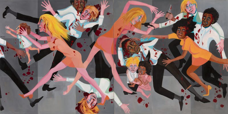
But things are ... different. The curators are up to something. They’ve rescued Faith Ringgold’s American People Series #20: Die, which used to hang in a passageway, and placed it in a room full of Picassos. Doris Salcedo’s Widowed House IV, a delicate construction of a door, some sheer fabric, and bone, is a whisper compared to Richard Serra’s insistent steel boxes in the gallery adjacent. Marisol’s Love, a plaster mouth imbibing or possibly fellating a glass Coke bottle, sits in front of Jasper Johns’s Flag (my favorite juxtaposition). It’s a quiet rebellion, an attempt to complicate how we think of the canon. But it’s not a lecture. These aren’t heavy-handed flourishes, but thought-provoking ones.
It’s impossible not to see the intent in the exhibitions that will inaugurate the new building—two shows focused on black artists (Betye Saar and the performance provocateur Pope.L) as well as a survey of midcentury South American abstraction. The MoMA understands the moment. Art is political territory, not least because it’s so tied to capital, and no museum will ever be, in a word, unproblematic. At least MoMA is facing this head on. Still, Saar and Pope.L belong inside these walls. The curators aren’t forcing this work on you because it’s nutritious; they’re celebrating it because it’s beautiful.
The shock of the new has worn into the comfort of seeing familiar friends, so the museum has painted some of its galleries. Purists will scoff, but I lingered in the purplish brown room dedicated to Surrealism, and I hate Surrealism. Lucio Fontana’s Crucifixion looked beautiful against that room’s gray walls; it made some kind of sense that the gallery dedicated to the shenanigans of the Fluxus crowd was an anxious shade of red.

It’s difficult to truly see something that we’ve seen a million times before. But MoMA just owns so damn much that chances are you’ll encounter something that has the capacity to startle. There’s an untitled Keith Haring I don’t recall ever seeing before, a manic tangle of black on white paper, the ink still seemingly dripping though the poor man has been dead almost three decades. It was like I’d never looked at Haring, or noticed how his work feels naïve and skillful at the same time. It makes you wonder what else the place has hiding in storage somewhere.
The MoMA has always been big, and exhausting. The expanded galleries that house that Haring and the contemporary stuff feel unending, a labyrinth. I panicked a little, to be honest. But the space is intelligently designed to lead you back (to the store, of course). Alas, the museum’s decision to put the café on the top floor complicates my usual strategy of working my way down, a cappuccino my reward.
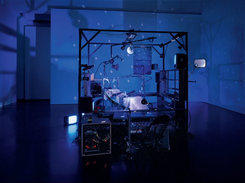
I didn’t even pay admission but I still wore myself out by habit, because I wrongly imagine museum-going to be the search for the most bang for my buck. It’s probably better to just wander. At one point, I ventured down a dark passage to find The Killing Machine, an installation by Janet Cardiff and George Bures Miller. Press a button and the thing comes to life, robotic arms pivoting over an empty chair where you cannot help but imagine yourself. The room fills with music, or maybe it’s just noise. It’s terrifying, it’s exhilarating, it’s confusing. If you go looking for transcendence, you’ll never find it. It has to sneak up on you. And it will. That alone is worth $25.
