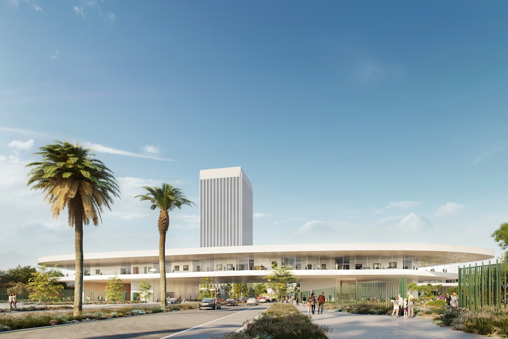
When the Swiss architect Peter Zumthor released his original plans for the new Los Angeles County Museum of Art in 2013, the building was meant to resemble an inkblot, oozing across Los Angeles’s horizon like an enigmatic brushstroke. Planners had hoped it would do for LA what Frank Gehry’s sweeping, silver Guggenheim outpost had done for Bilbao, attracting tourism to the Spanish city in the 1990s. But in subsequent revisions, the dramatic, inky color of Zumthor’s original design became a flat beige (critics believed a black building would have been too difficult to keep cool), and a wing that was supposed to meander over the La Brea tar pits—the inspiration for Zumthor’s first design—was moved to an adjacent parking lot. The latest renderings show a building even shorter, and smaller, than before, straddling Wilshire Boulevard like a toll plaza. People have compared it to a coffee table and an Italian roadside restaurant. The whole project is estimated to cost a cool $650 million, nearly one-fifth of it coming from taxpayers.
Los Angeles isn’t the only city to foot the bill for a splashy public space that seems designed more to attract Instagram tourism and goose up real estate prices than anything else. In 2007, Hamburg broke ground on its new Elbphilharmonie, whose elaborate building—part concert hall, part apartments for the ultrarich—was completed seven years late, at a cost of more than €700 million. In 2015, Paris finished work on its Philharmonie, a lumpy, crash-landed-spaceship-like building that the architect later disowned. (“The architecture is martyred,” he wrote in Le Monde.) Of all these projects, LACMA, somehow, manages to be even more farcical. It’s a lose-lose situation for pretty much everyone and everything involved—architect, audience, and the city of LA.
The museum has been through three contentious redesigns before, but the thing it needed all along was more room. Its collection—which includes pre-Columbian relics, as well as modern showpieces like Chris Burden’s Urban Light—was already bursting its four current buildings at the seams. Now, it will be squeezed into a space two-thirds the size. To compensate, the museum is considering building LACMA satellites throughout the city, but these seem little more than a convenient excuse for real estate investors to kick-start the all-too-familiar gentrification process.
Moreover, the shows the new museum was designed to house will do little to turn ordinary visitors into committed art lovers. I’ve been to a few of the kind of themed exhibits LACMA’s director, Michael Govan, favors, and each time I feel the curators assume that the public does not care about art in the first place, or, worse, that they’re too dumb and impatient to consume very much of it. In LACMA’s recent show, “To Rome and Back,” a fifteenth-century German woodcut of the Virgin and Child was placed near a painting of 1920s flappers adjusting their stockings to symbolize ... what exactly? Nobody really knows.
Govan had probably hoped Zumthor would design a building as unique as his famous Therme Vals spa in Switzerland, which features moody quartzite rooms intermingled, sensuously, with water features and natural light. But Zumthor has never built something of the scale and complexity of a large municipal art museum, and it shows. The clunky, amoebalike building cannot seem to decide between the digitally derived expressionism of such architects as Frank Gehry or Zaha Hadid, and Zumthor’s own brand of minimalist modernism. We’re left with a museum that benefits nobody and satisfies none of the needs of the art in its collection, nor of the public that will view it. And yet in April, it was approved, because what is most important to Govan and the county isn’t art at all, but money, and as they say in the architecture world, form follows function.
