Despite appearances to the contrary, this year’s presidential follies have managed to feature at least a few policy discussions amid all the name-calling.
Income inequality in particular has animated voters on both sides of the partisan divide, but the solutions advocated by candidates from each party are markedly different.
Democrats claim higher taxes on the rich and more benefits for the poor are the best ways to reduce inequality. Republicans argue what we really need is more growth, accomplished by lowering taxes to spur work and investment with, it seems, benefit cuts to make up lost revenue.
Remarkably, this debate has taken place based on partial and inappropriate indicators of U.S. inequality. Each party is dead certain about how to address inequality, yet neither knows what it is. Neither has a comprehensive and conceptually correct measure of inequality. The right measure is not how much wealth or income people have or receive but their spending power after the government has levied taxes on those resources and supplemented those resources with welfare and other benefits.
In a just-released study, we provide the first picture of actual U.S. inequality. We account for inequality in labor earnings and wealth, as Thomas Piketty and many others do. And we get to the bottom line: what does inequality in spending look like after accounting for government taxes and benefits?
Our findings dramatically alter the standard view of inequality and inform the debate on whether and how best to reduce it.
The methodology
Our study focuses on lifetime spending inequality because economic well being depends not just on what we spend this minute, hour, week or even year. It depends on what we can expect to spend through the rest of our lives.
Measuring lifetime spending inequality for a representative sample of U.S. households was a massive, multi-year undertaking, which may explain why ours is the first such study.
It required two big things. The first was developing software that properly measures lifetime spending, taking into account all possible survival scenarios households face (e.g., a husband dies in 22 years and a wife in 33 years). Second, it required accounting, in meticulous detail, for all the taxes households will pay and for all the benefits they will receive under each scenario. Our list included everything from personal income taxes (with its copious provisions) to estate taxes to Social Security benefits (eight kinds). Our paper lays out all the gory details.
The raw data came from the Federal Reserve’s 2013 Survey of Consumer Finances (SCF), which we ran through a computer program called The Fiscal Analyzer (TFA). We designed TFA to calculate the present value of the annual spending, including final bequests, a household can sustain given its “resources” (current wealth plus the present value of their projected future labor earnings), its taxes and benefits and limits on its borrowing capacity. Our lifetime spending measure appropriately weights the spending arising under each survival scenario. The weights are the probabilities of the survival scenario in question and account for the fact that the rich live longer than the poor.
One final methodological point: since we are comparing lifetime spending inequality, it makes no sense to compare households of different ages, with very different lifespans. So we divided them up by age cohorts (30-39, 40-49, etc).
Next we ranked the households in each cohort according to the size of their resources, as defined above. Finally, we split the households into five equal groups or quintiles, with the lowest quintile having the lowest amount of resources and so on. We also considered households ranked in the top 5 percent and top 1 percent based on resources.
The results
So what did we learn?
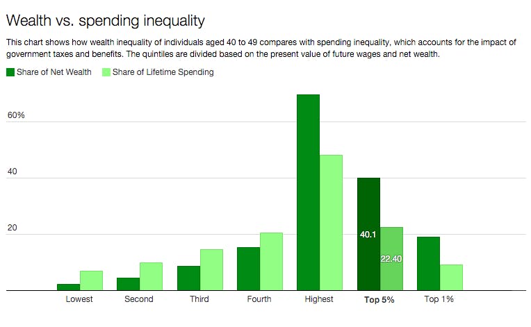
First, spending inequality—what we should really care about—is far smaller than wealth inequality. This is true no matter the age cohort you consider.
Take 40-49 year-olds. Those in the top 1 percent of our resource distribution have 18.9 of net wealth but account for only 9.2 percent of the spending. In contrast, the 20 percent at the bottom (the lowest quintile) have only 2.1 percent of all wealth but 6.9 percent of total spending. This means that the poorest are able to spend far more than their wealth would imply—though still miles away from the 20 percent they would spend were spending fully equalized.

The fact that spending inequality is dramatically smaller than wealth inequality results from our highly progressive fiscal system, as well as the fact that labor income is distributed more equally than wealth.
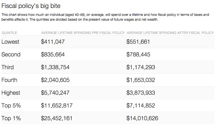
The top 1 percent of 40-49 year-olds face a net tax, on average, of 45 percent. This means that the present value of their spending is reduced by the fiscal system to 55 percent of the present value of their resources. So someone in that age group who has resources with a present value of $25.5 million can spend $14 million of it after fiscal policy.
For the bottom 20 percent, the average net tax rate is negative 34.2 percent. In other words, they get to spend 34.2 percent more than they have thanks to government policy (they get to spend, on average, $552,000 over their lifetimes, which exceeds their $411,000 in average lifetime resources). The table below illustrates this for all quintiles.

To be clear, spending power remains extremely unequal.
Our point is that the fiscal system, taken as a whole, does materially reduce inequality, not in what people own or earn, but in what they get to spend.
This limits the scope to further equalize spending power by taxing the top 1 percent at a much higher rate. Indeed, among 40-49 year-olds, confiscating all the remaining spending power of the top 1 percent (with a 100 percent tax rate) and giving it to the poorest 20 percent would leave the latter group with 16.1 of total spending power, which is still less than 20 percent. And this hypothetical calculation assumes the jobs and incomes of those workers aren’t adversely affected by such a policy, which they most certainly would be.
Impact on work incentives
Another key finding is that U.S. fiscal policy acts as a serious disincentive to work longer hours or harder for more pay.
Our system’s plethora of taxes and benefits—designed with a multitude of income and asset tests and with little regard to how they work as a whole—have left many households facing high to super high net marginal tax rates. These rates measure what a household gets to spend (in present value) over its remaining lifetime in exchange for earning more money now.
For example, a typical 40-49 year-old in any of the bottom three quintiles (poor to middle class) of our resource distribution will only get to spend about 60 cents of every dollar he or she earns. For the richest 1 percent in that age group, it’s just 32 cents.
We often hear critics of the tax system, such as billionaire Warren Buffett, suggest that the rich pay very little on average or at the margin in taxes. This reflects their omission of a long list of current and future taxes plus their failure to focus on lifetime spending.
Judging rich and poor
One more major finding. Our standard means of judging whether a household is rich or poor is based on current income. But this classification can produce huge mistakes.
For example, only 68.2 percent of 40-49 year-olds who are actually in the third resource quintile using our data would be so classified based on current income. In other words, nearly a third of the people we identified as middle income are being mis-classified as either richer or poorer. Similarly, among the poorest 20 percent of 60-69-year-olds, about 36 percent are actually poorer than commonly understood.
Consequently, relying on average current-year net tax rates to assess fiscal progressivity, as is standard practice, can be far off the mark.
Facing fiscal facts
Facts and figures are hard things. They upset prior views and demand attention.
The facts revealed in our study should change views. Inequality, properly measured, is extremely high, but is far lower than generally believed. The reason is that our fiscal system, properly measured, is highly progressive. And, via our high marginal taxes, we are providing significant incentives to Americans to work less and earn less than they might otherwise.
Finally, traditional static measures of inequality, fiscal progressivity and work disincentives that a) focus on immediate incomes and net taxes rather than lifetime spending and lifetime net taxes and b) lump the old together with the young create highly distorted pictures of all three issues.
As candidates and voters debate inequality and the best ways to reduce it, it’s important to start with the actual facts. That will make it far easier to figure out which policies, if any, should be changed going forward.
Raising taxes and benefits as Democrats advocate will, unless existing tax and benefit systems are properly reformed, come at the cost of even larger work disincentives. Lowering taxes as Republicans advocate—presumably funding this with benefit cuts—will improve work incentives but may exacerbate spending inequality unless the benefit cuts disproportionately hit the rich.
Fortunately, we now have the machinery in place to accurately assess fiscal reforms in a manner consistent with economic theory and common sense.
![]()
This article was originally published on The Conversation. Read the original article.
