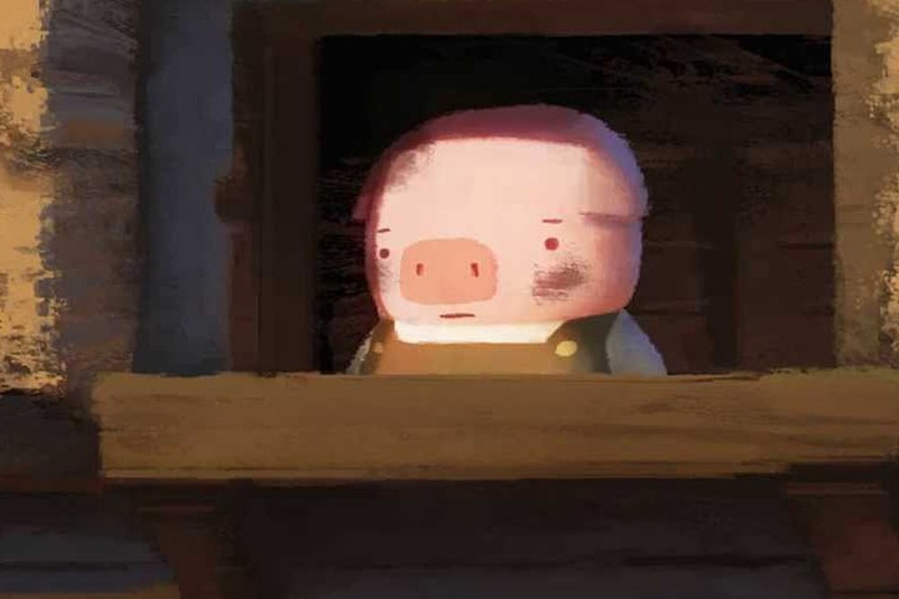
Take a second to ogle the quintet of animated short films up for the Oscar on Sunday, then try to feign surprise if The Dam Keeper claims the statuette. The 18-minute 2-D animation, the longest of the nominated shorts, tells the story of a young pig charged with maintaining the dam at the edge of a town of varied animals. It also achieves the most enduring, consistent look among the five contenders, belying a precision befitting its Pixar-alumni animators with a grimy style that drives the emotional journey of our blue-collar orphan hero pig.
Every eight hours, the pig must crank the windmill atop the dam to hold back a smoggy miasma lurking on the other side. He bears this duty alone, yet despite its importance, other animals at school tease him (snorting noises and flared nostrils, so hurtful). When a plucky fox befriends him, matters seem to improve; that camaraderie balances an otherwise somber tale of bullying, solitude, and burdens borne in silence. Visually, the film's lines are porous, its textures mottled. The colors of the village and of the menagerie of little animals are Easter-bright, often set against long, low-sun shadows. You'll recognize the quavering brush strokes visible in every shot from the first coat you slapped up when you last painted your apartment walls.
Unlike most of their competition, Robert Kondo and Dice Tsutsumi reached past the glossy texture popularly associated with animated films. As The New York Times, noting the enthusiasm the film has found among animators, remarked: "[F]igures and settings have a looseness of texture that contrasts vividly with the hard-edge look of big-ticket features that rely on computer graphic imagery." The two artists crafted the frames of their collaborative debut and then set out to scuff them, enlisting students to apply Photoshop's paintbrush tool to sully the look. Our hero pig gets picked on, partly, because his sooty workplace leaves him constantly smudged, and the feel of The Dam Keeper holds true to that ambiance. If you were to reach out and touch the screen, it seems, your hands would return dusty and mottled, as when raking your arm along a chalk pastel drawing.

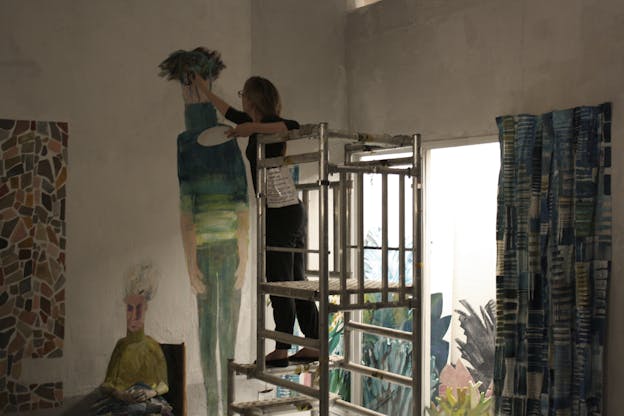
Among the other four shorts, only Britain's melancholy, affecting nominee, The Bigger Picture, has anywhere near so grimy a visual style and—not coincidentally—also attempts an ambitious emotional arc. It combines a schmear of stop-motion animation with characters rendered in acrylic paint on walls and around props, frame by laborious frame. The story, about the anxiety between two brothers as they care for their aging mother, reeks of gloom. The choice of medium—clumping paints, shimmering plastics for water, real furniture and props, life-sized sets—gives a tactile heft to the frustration and grief in the picture. In this year’s animated shorts, the texture is decidedly the message.
The Dam Keeper might have nosed to the front of the line if even it had chosen a cleaner look. Despite its hand-drawn charms, Me and My Moulton, a Norwegian-Canadian production about a girl's life at home with her family, tilts twee. Disney's Feast, a six-minute tale of a Boston terrier's gustatory world, and the Netherlands' A Single Life, two minutes of pure silly joy about a time-traveling turntable, both run small. For their technical brilliance and keen humor, they're not able to hit more than a couple of (admittedly, pitch-perfect) notes.
Animators have an omniscient control of their visuals that must be the envy of live-action directors fighting weather, travel budgets, location permitting, colicky actors, and the cost of gassing up the chopper. You see the benefits of that control in The Dam Keeper 's rendering of light, a point of pride for the filmmakers. As Tsutsumi told Variety, "When we paint, we try to paint light, not just shape, and that’s one thing we tried to capture in this film that I think gave us a kind of signature look." The artists may have cut their teeth at Pixar, but their aesthetic owes more to the form and motion of Hayao Miyazaki's Studio Ghibli productions. (For what it's worth, Tsutsumi married a niece of Miyazaki's.) They're also signaling subtly, as they tousle the look of their meticulous images, that they're not going for a micromanaged look. That decision points to a tension in animation: sheer dollars. If you're drawing on an indie budget, there's an advantage to choosing a lo-fi, spontaneous look to define you, because it sets you apart from Disney and Pixar, which have more money than Santa.
Pixar, with its Olympian resources, has come to dominate the animation scene in the last two decades. Even as its charmed run of smash hits in the early 2000s has tapered off somewhat, the animation studio still has the resources to ensure that constant refinement does not become stiffness. As a result, among animated features, polish still triumphs. Of the 13 awards given since the Best Animated Feature category began in 2001, all but four (and none of the past seven) have come out of the Disney-Pixar-Industrial Light & Magic complex. Part of the reason: The type of computer-intensive digital animation Pixar champions has propelled the cost of making high-end animated features to the realm few others can sustain.
Year-by-year, the disparities in price between those winners and the Best Picture winners since 2006’s The Departed rang up a $90 million price tag are staggering. Last year, for instance, 12 Years a Slave won Best Picture at a production cost of $20 million. Frozen, the Best Animated Feature, cost $150 million. In 2013, it was Argo ($44.5 million) and Brave ($185 million). Year before, The Artist ($15 million) and Rango ($135 million). In 2010: The King's Speech ($15 million) and Toy Story 3 ($200 million). Same chasm the previous year, of course, with The Hurt Locker ($15 million) and Up ($175 million), and in 2008, with Slumdog Millionaire ($15 million) and Wall-E ($180 million). Before that, it was No Country for Old Men ($25 million) and Ratatouille ($150 million). In other words, you could have made every Best Picture winner of the past six years for the cost of any one of the Best Animated Feature winners in that time.
You can still make brilliant, commercially successful animated movies for much less, albeit typically overseas. Studio Ghibli’s Spirited Away and Nick Park's Wallace & Gromit: The Curse of the Were-Rabbit both won feature Oscars spending a fraction of Pixar's bullion. They're the exception, though, and it's not as if Studio Ghibili or Aardman Studios is an upstart these days.
So in order to see an esoteric, artistically risky animated film win an Oscar, you've got to turn to the shorts category—weirder, cheaper and much older than the feature category. Its aesthetic choices in recent years, too, contrast with the high spit-sheen of the dominant features. Last year's winner, Mr Hublot, was immaculately rendered 3-D, but set in a grubby, steampunky futurescape besotted with garbage and pollution; the 2010 winner, The Lost Thing, took much the same tack. Thematically 2009’s Logorama was one of the most rebellious, raw films to be honored in recent years of any stripe, its slick animation style notwithstanding. If The Dam Keeper joins those ranks Sunday, it will be in part because Kondo and Tsutsumi nailed the look and feel of a piece. Even when it's rendered painstakingly in Photoshop, the appearance of a fallible human touch still tugs at the heart.
For more Oscar coverage, click here.
