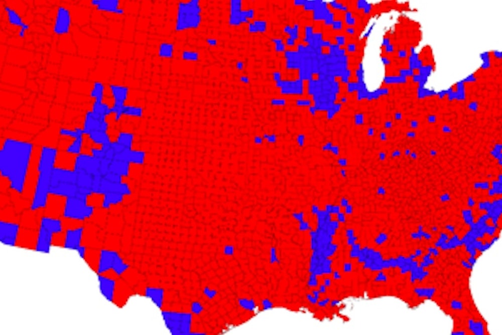
I live on county maps. They offer an accessible, yet incredibly rich way to understand the diversity of our country.
But they’re also imperfect. An unfamiliar eye might draw the wrong lessons, like concluding that the country is overwhelmingly Republican.
According to Dave Weigel, a handful of conservatives in Virginia are struggling to reconcile a state painted red with a narrow McAuliffe victory. Obviously, the explanation is that the handful of “blue” counties have many, many more people than the “red” counties.
In fairness to those Virginia conservatives, this is a common issue. A couple of months ago, a map of AIDS in the United States went viral with the accompanying statistic that 92 percent of AIDS cases occur in 25 percent of counties.
But what percent of the population lives in those same 25 percent of counties? I actually don’t know, but I know that 84 percent of Americans live in the largest 25 percent of counties. I also know that 50 percent of the population lives in 5 percent of counties. So the statistic was mainly, although not exclusively, telling us that most people live in a handful of counties. There might be something interesting about where people with AIDS live (like, they’re probably more likely to live in urban counties) but that was left for me to deduce from my unreasonable level of knowledge of America’s counties.
Fortunately, there’s a solution: the cartogram, where the area of spaces on a map is determined by a variable other than geographic area. In this case, it’s population: Make the most populous counties proportionately larger than the least populous counties.
Check out how it works for 2012. Here’s the “normal county map” (kudos if you can tell that this isn't the final result) from Mark Newman at the University of Michigan.
Here’s the cartogram.
Notice just how many Americans live in a handful of counties, like Los Angeles, Cook (Chicago), or in the New York City area, or how the high plains are reduced to a compressed series of lines.
You could even add margin of victory (more kudos if you see a county that's really messed up):
And here's Virginia's 2012 presidential election results (unfortunately, I don't see anything from last week's gubernatorial contest). I'd just like to flag the underappreciated significance of southeastern Virginia's heavily Democratic, heavily African American urban centers, like Richmond and Norfolk, which are underappreciated partners with northern Virginia in Virginia's Democratic coalition. That's partly the result of D.C. bias, but it's also because these heavily populated cities are just tiny dots on Virginia's standard county map.
I wish infographic departments would give readers the power to flip between a traditional county map and a cartogram. Otherwise, many or maybe even most readers will wrongly assume that the most common color on the map is most representative of the population, while largely ignoring the metropolitan communities that dominate the country. That's especially true for maps dealing with urban challenges, like poverty or education.
