You know how the end of a cash register tape has that thick pink line running through it, to alert the user that the roll is about to run out? Same thing with credit card paper—when the roll is near the end, you get that annoying colored streak running through the receipt.
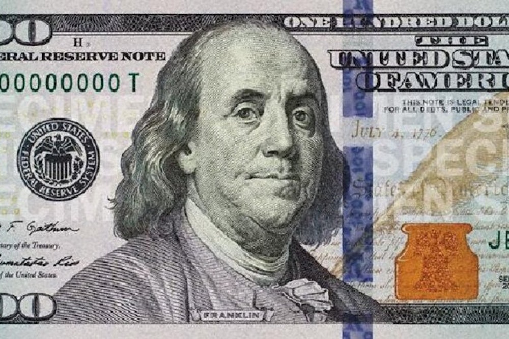
That was the first thing that came to mind upon seeing the design for the new $100 bill, which will start circulating in early October. The redesigned note features a thick blue line running down the center. Is that to notify the Bureau of Printing and Engraving that they're running out of paper?
Nope. Like virtually every other aspect of currency design these days, the blue line is a security feature designed to foil potential counterfeiters. That's no small matter with the $100 bill, which is America's most widely counterfeited denomination. The odd thing about the blue line, at least at first glance, is that it actually makes the bill seem more like a phony, because the line looks like a printing glitch. Or at least that's how it appears when viewed on a computer. The line is supposedly embedded with little images and numerals that will move and shift when the bill is shifted, so maybe it will seem more high-tech and legitimate when viewed in person. (You can learn more about this, and about the other security features in the new bill, in this interactive display.)
Things don't get much better on the back of the bill, which features a huge, gold "100" printed sideways. The large type is to help the visually impaired, but was it absolutely necessary to position it sideways? Even Monopoly money looks more official and dignified than this.
Hovering over all of this is the visage of one Benjamin Franklin, who's been depicted on the front of the $100 bill since 1914. Franklin, of course, was many things—politician, scientist, inventor, musician, and more—but it's instructive to note that his grave simply lists him as a printer. One wonders whether he'd have been awestruck or appalled by the printing shenanigans that have been incorporated into the note that bears his likeness. Perhaps a bit of both.
As noted in last week's OMFG column, this has been a very active season for new beverage packaging, often with an ergonomic slant. That trend has gone from the ridiculous to the sublime with the announcement of a new can design for Sam Adams beer, which will start appearing in stores this summer.
If you can't remember what the old Sam Adams can looked like, that's because it didn't exist. Sam Adams honcho Jim Koch has never allowed his product to be sold in cans, believing them to be an inferior beer delivery system. But he recently hired the design firm IDEO to explore the possibilities of a new can design.
The result, after several years' worth of development, is a can with a slightly wider top. And the indented area just below the can top—the area that your lower lip presses against as you drink from the can—is less indented than on a standard can. Koch says this shape will "open your mouth up more" when you drink the beer, leading to a richer sensory experience (or maybe just faster consumption).
Of course, there's another way to get a fully realized drinking experience from canned beer: Just pour it into a glass.
Do you know of a new product, service, design, or phenomenon that deserves a closer look? Send tips, samples, press releases, and best intentions here, and follow One-Man Focus Group on Twitter.
